How to Choose Coastal Colors for Your Home: The Complete 2025 Guide
This post may contain affiliate links. If you make a purchase through one of my links, I may receive a small commission at no cost to you.
Walking into a coastal-inspired home feels like an instant vacation! The soft, airy colors and beach-inspired palette can transform any space into a relaxing seaside retreat.
According to interior design experts at Sherwin-Williams, nearly 68% of homeowners are incorporating some elements of coastal design in their homes this year. And it’s starting with choosing the right colors.
Image Credit: Kelsey Rodgers of Oak Island, NC
I've spent years helping homeowners create beautiful coastal spaces, and I'm excited to share everything you need to know!
Homes with coastal color schemes sell 29% faster than homes with standard color palettes because they are timeless, versatile colors that create instant appeal.
But how do you choose the right coastal colors without making your home look like a kitschy beach souvenir shop?
This guide will walk you through how to select and combine the perfect coastal hues to create a relaxing, sophisticated beach-inspired home that feels fresh and timeless.
What are coastal color palettes and how do I choose the right one for my home?
Coastal color palettes go far beyond the stereotypical blue and white combinations you might initially picture. These versatile schemes draw inspiration from different seaside environments worldwide, each with unique characteristics and emotional resonance.


Image Credits: Phyllis Stedtson of San Diego, CA; Heather Brunt of Cape Cod, MA; Celeste Monroe of Southport, NC
Traditional coastal palettes often feature a foundation of whites and creams paired with ocean blues, but authentic coastal design incorporates a broader spectrum. Think of the many colors you encounter at the shore—from pale sandy beiges to deep navy blues, soft seafoam greens to vibrant coral accents. Each element of a beach environment can inform your color selections.
Regional coastal styles offer distinct variations worth exploring.
Mediterranean coastal colors embrace warmer tones with terra cotta, olive green, and azure blue.
New England coastal schemes tend toward nautical influences with navy blue, crisp white, and weathered grays.
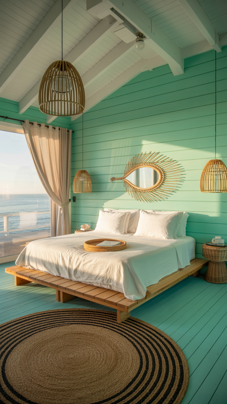
Tropical coastal palettes incorporate brighter blues, vibrant corals, and lush greens inspired by island environments.
The enduring popularity of coastal colors stems partly from their psychological benefits. These palettes typically feature blue prominently—a color scientifically proven to lower blood pressure, reduce stress, and promote feelings of tranquility. The neutral foundations of coastal schemes also create an airy, open feeling that makes spaces appear larger and more serene.
When designing your coastal-inspired home, consider which regional variation resonates with your personal style.
Are you drawn to the understated elegance of Cape Cod? The vibrant energy of a Caribbean beach? Or perhaps the refined sophistication of the Mediterranean coast? Understanding these distinctions will help you create a cohesive and authentic coastal color scheme.
What are the best coastal paint colors for a beach-themed home?
Selecting the right coastal colors begins with understanding the essential palette components that create that coveted beach-inspired look. Let's explore the building blocks of effective coastal color schemes.
Blues form the heart of any coastal palette, representing the ocean and sky that define seaside environments. Navy blue offers timeless sophistication and pairs beautifully with whites for a classic nautical look—perfect for more formal spaces or creating striking accents. Aqua and turquoise capture the vibrant clarity of tropical waters, ideal for creating energy in gathering spaces. Lighter sky and powder blues evoke peaceful coastal mornings and work wonderfully in bedrooms and bathrooms where relaxation is paramount.

Image Credit: Celeste Monroe of Southport, NC
Neutrals provide the essential foundation for coastal design, creating the bright, airy feeling characteristic of seaside homes.
Crisp whites like Benjamin Moore's "Simply White" or Sherwin Williams' "Alabaster" reflect abundant natural light, making spaces feel larger and more open.
Sandy beiges and taupes like "Manchester Tan" or "Sea Salt" (one of my personal favs!!) bring warmth while referencing beach elements.
Weathered grays such as "Silver Strand" or "Mindful Gray" add sophistication and depth, reminiscent of driftwood and weathered coastal structures.
Accent colors inject personality into coastal schemes. Coral shades add warmth and vibrancy, referencing underwater reefs and sunset skies. Seafoam and sage greens bring in references to coastal vegetation and sea glass. Buttery yellows can capture sunlight dancing on water, while muted terra cottas might reference weathered coastal tiles or clay.
Successful coastal combinations often follow the 60-30-10 rule:
60% dominant neutral color
30% secondary color (often a blue)
10% accent color for visual interest
For example, a living room might feature warm white walls (60%), navy blue furniture (30%), and coral accents in pillows and art (10%). This balanced approach creates visual harmony while maintaining the light, airy coastal feeling.
The main point here is that coastal colors should relate to specific coastal environments rather than generic "beach themes." A Mediterranean-inspired palette might feature whitewashed walls with accents of azure blue and terra cotta, while a Maine coastal cottage might combine foggy grays with navy blue and buttery yellow accents.
How do I choose coastal colors for different rooms in my home?
Each room in your home presents unique opportunities to incorporate coastal colors while serving its specific function and atmosphere. Let's explore tailored approaches for different spaces.
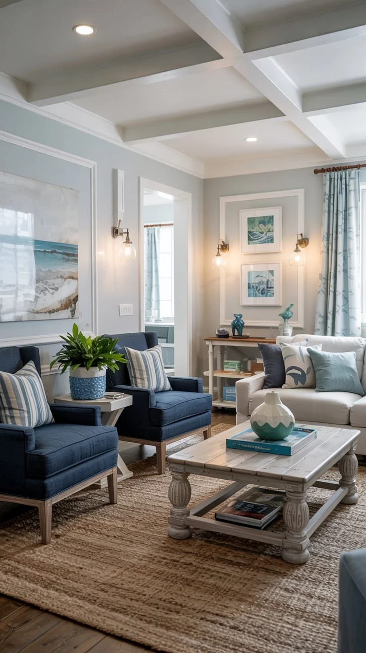
Image is AI-generated
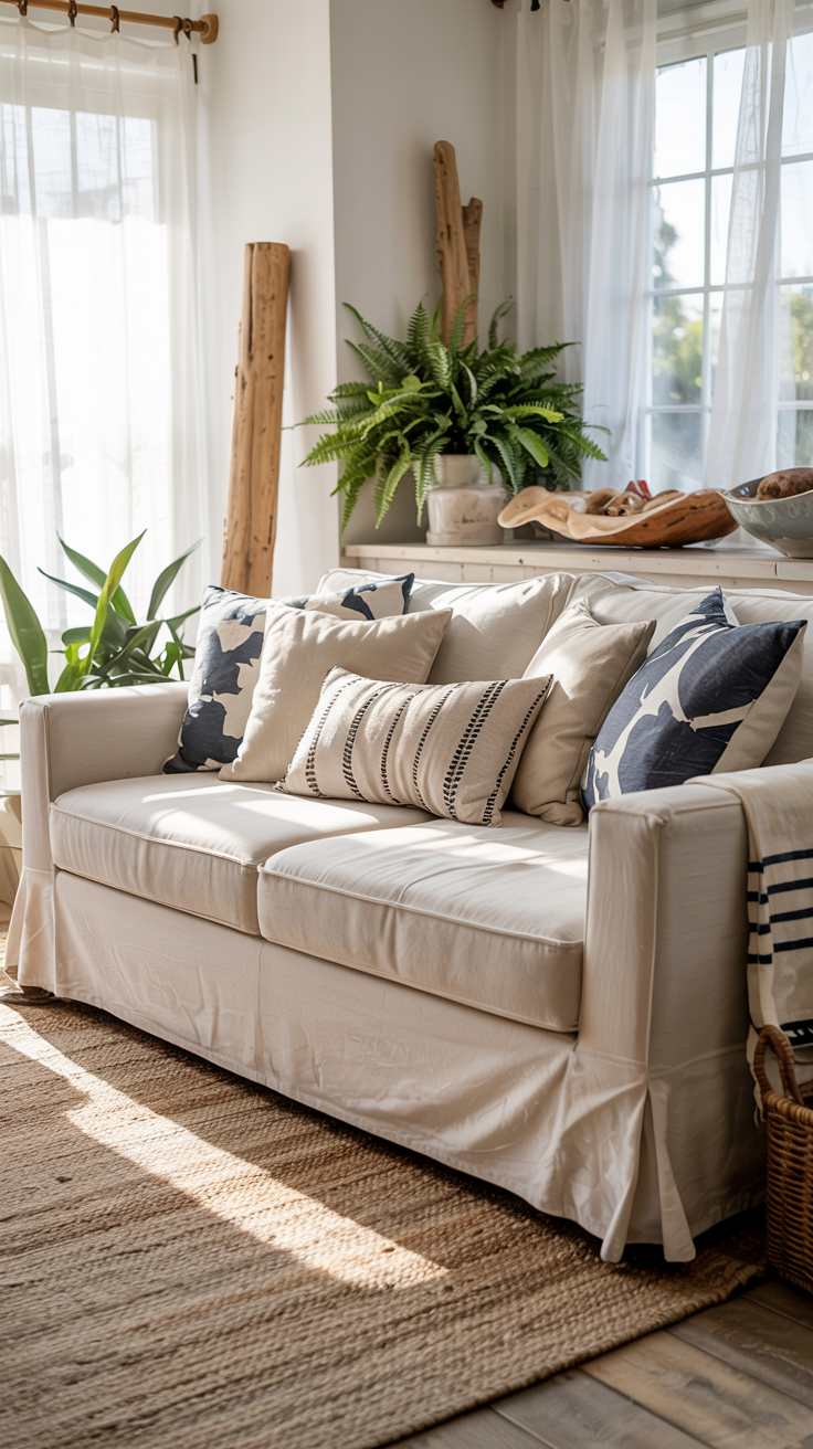
In living rooms, coastal colors should create both welcome and relaxation.
Consider Benjamin Moore's "Pale Oak" or Sherwin Williams' "Sea Salt" for walls—these subtle neutrals provide an airy backdrop.
Furniture in deeper blues like navy or indigo anchors the space while referencing ocean depths.
Accent with natural textures—jute rugs, linen curtains, and weathered wood coffee tables enhance the coastal feel without requiring additional colors.
For a more vibrant coastal living room, try aqua accent chairs or coral throw pillows against neutral foundations.
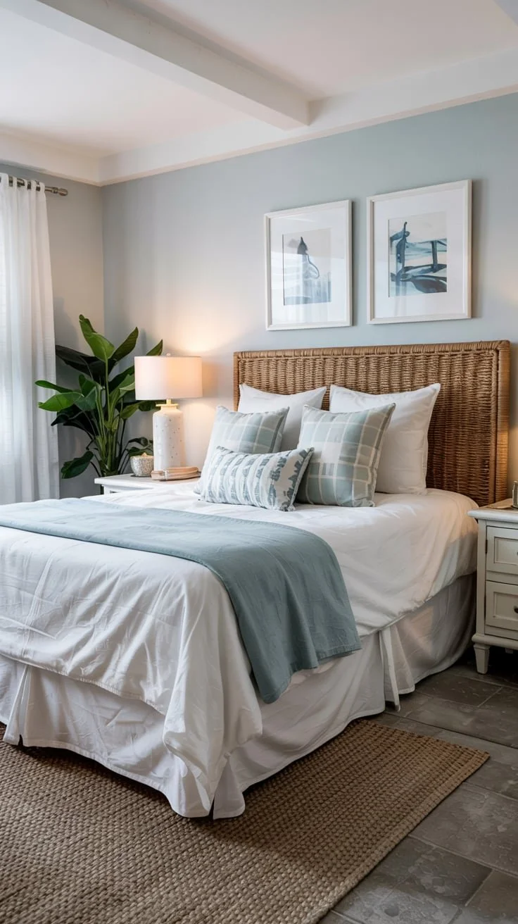
Image Credit: Denise May of Sunset Beach, NC
Bedrooms benefit from the most calming coastal shades.
Soft blue-grays like "Sleepy Blue" or "Misty" on walls promote rest, while white bedding creates that crisp, hotel-like freshness associated with beach getaways.
Layer in textural elements like a chunky knit throw in seafoam green or decorative pillows in subtle patterns inspired by waves or sand ripples.
Keep artwork simple and serene—perhaps a horizon line seascape or abstract that suggests water movement.
Kitchens and dining areas can embrace coastal colors while maintaining practicality.
White or light gray cabinetry creates the classic coastal brightness, while navy lower cabinets with brass hardware offer a nautical touch.
Backsplashes in seafoam green glass tile or white subway tile with light blue grout add subtle coastal references.
For dining areas, consider chairs in varying shades of blue surrounding a weathered wood table, or opt for rattan chairs to reference coastal textures.

Image Credit: Lee Marsalko of Oak Island, NC
Bathrooms present perfect opportunities for stronger coastal references.
Benjamin Moore's "Breath of Fresh Air" or Sherwin Williams' "Rainwashed" create spa-like atmospheres that reference water.
White fixtures maintain brightness, while accessories in sea glass greens or coral add personality.
Consider shower curtains or towels with subtle coastal patterns, think gentle waves rather than obvious seashell prints.
Outdoor spaces should extend your interior coastal palette while harmonizing with the natural environment.
Sherwin Williams' "Extra White" for exterior trim paired with a soft blue-gray like "Atmospheric" creates classic coastal architecture.
Furnish with weather-resistant pieces in navy, white, and perhaps accents of red for a nautical touch, or choose weathered teak with aqua cushions for a more tropical coastal approach.
Throughout your home, transitions between spaces should feel natural within your coastal scheme. Using slightly different shades of your core colors in adjacent rooms creates subtle distinction while maintaining overall harmony.
What's the best way to test coastal paint colors before committing?
Selecting the perfect coastal colors requires methodical testing in your specific environment before making final decisions. Light conditions vary dramatically between homes and even between rooms, significantly affecting how coastal colors appear.
Begin by collecting paint swatches and samples of your preferred coastal palette.
Rather than evaluating these in isolation, view them together as a collection to ensure harmony.
Create color boards by attaching paint chips alongside fabric swatches, flooring samples, and any fixed elements you need to coordinate with, like countertops or existing furniture.
When testing actual paint colors, follow these essential practices for accurate evaluation.
Purchase sample pots of your top choices and paint large swatches (at least 2'x2') on multiple walls in each room.
Position these swatches where they'll experience different lighting conditions—near windows, in corners, and on walls that receive direct and indirect light.
Observe these samples at different times of day, from bright morning sunlight to evening lamplight, noting how the colors shift.
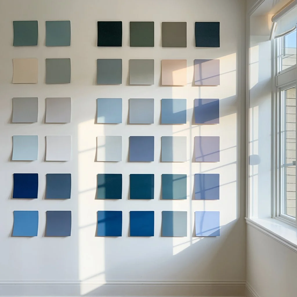
Image Credit: Celeste Monroe of Southport, NC
If you don’t want to paint sample swatches directly on your walls - here’s how I did it when I repainted my dad’s coastal living room: I took standard, white printer paper, and brushed the sample color on the paper and let it dry. I painted many of them, based on the number of walls or the different areas of his living room where I wanted to see how the light hit the color. Then I went around his living room, and taped the paint color paper on the wall in areas that had different lighting, both natural and artificial. By doing it this way, I didn’t have to repaint his walls back to his original color if I didn’t like the paint color. I just crumpled up the papers and threw them out. Also, don’t throw out the rejected sample paint, use it for DIY projects so it doesn’t go to waste.
Digital tools can provide preliminary visualization before testing physical samples. Apps like ColorSnap from Sherwin Williams allow you to upload photos of your rooms and digitally "paint" the walls. While these tools provide general impressions, they cannot fully replicate how light will interact with actual paint in your space.
Common testing mistakes to avoid include: evaluating colors under store lighting (which differs dramatically from home lighting), judging colors from small paint chips alone, failing to consider existing elements like flooring and trim, and not testing colors adjacent to each other when they'll be used in connecting spaces.
Take advantage of professional resources like larger-format color cards, fan decks, or peel-and-stick paint samples that minimize the mess of traditional sample pots. Many paint retailers also offer color consultations that can provide expert guidance on coastal palettes specific to your home's conditions.
Remember that coastal colors in particular can appear dramatically different depending on natural light exposure and direction.
North-facing rooms tend to make blues appear more gray, while south-facing rooms enhance the warmth in beiges and creams. East-facing rooms showcase colors most truly in morning light, while west-facing spaces may make colors appear warmer in afternoon sun.
How can I incorporate coastal colors with my existing furniture and fixtures?
Creating a coastal color scheme rarely happens in a blank-slate environment. Most homeowners need to harmonize new coastal colors with existing elements like furniture, architectural features, and fixed installations.
When working with existing furniture, identify its undertones. Is it warm or cool? Then select coastal colors that complement rather than clash. Warm wood furniture pairs beautifully with coastal colors that have yellow or red undertones, like sandy beiges, coral accents, or warmer blues like periwinkle. Cooler-toned furniture works better with coastal colors featuring blue or gray undertones, like crisp whites, slate blues, or seafoam greens. Rather than fighting against dominant furniture pieces, choose coastal colors that enhance them.
Architectural features present both challenges and opportunities. Exposed wooden beams can be incorporated into your coastal scheme as an organic element reminiscent of driftwood or weathered boardwalks. Stone fireplaces might inform accent colors—perhaps pulling out the gray-blue tones in stone for nearby wall colors. For challenging fixed elements like dated tile or flooring, choose coastal colors that minimize their prominence rather than drawing attention to them.

Image Credit: Art Klys of Myrtle Beach, SC
If you’re budget-conscious, phase in coastal colors gradually. Begin with wall paint which is the most impactful and economical change you can make. Next, introduce smaller coastal-colored accents through pillows, throws, and artwork. As budget allows, replace larger elements like area rugs, window treatments, and eventually furniture pieces. This layered approach creates a cohesive coastal feel over time without requiring immediate major purchases.
For immovable elements that clash with traditional coastal palettes, consider adapting your approach. With terracotta tile flooring, for instance, embrace a Mediterranean coastal palette featuring whites with warmer blues and coral accents rather than cool aquas. With dark wood trim that cannot be painted, select wall colors like warm whites or soft beiges that create contrast without fighting the wood's warmth.
Remember that authentic coastal design draws inspiration from real coastal environments—many of which feature natural wood, stone, and organic elements. Rather than viewing existing features as obstacles, consider how they might represent elements you'd naturally find in coastal settings, then build your color scheme around embracing rather than disguising them.
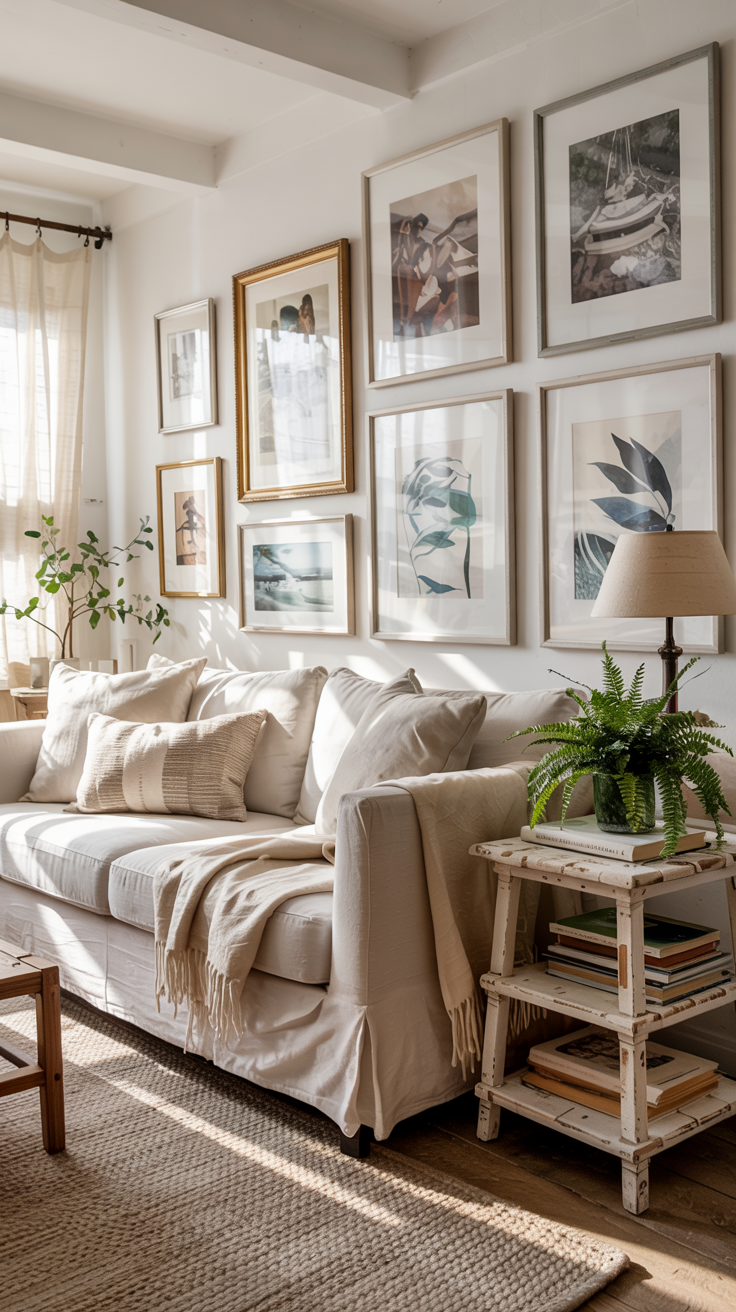
What coastal color accents will give my beach-themed home more depth?
While foundational coastal colors establish your overall palette, thoughtfully chosen accents create depth, visual interest, and personal connection to your coastal-inspired space. These elements allow for expression without compromising the serene, airy quality of coastal design.
Textiles offer the most versatile way to introduce coastal accent colors and patterns.
Layer sofas and beds with pillows featuring varying shades of blue, from navy to aqua, alongside neutrals with subtle coastal patterns like abstract waves or gentle stripes.
Throws in cable knit or lightweight linen add textural interest in accent colors like coral, seafoam green, or buttery yellow.
Area rugs can ground spaces with nautical stripes, abstracted wave patterns, or simple jute textures that reference sandy beaches.
Window treatments in sheer whites or soft blues enhance the light, breezy coastal feeling.
Artwork and decorative elements reinforce your coastal palette while adding personality.
Consider watercolor seascapes, abstract pieces in blues and neutrals, or black and white coastal photography.
Display collections of sea glass in hurricane lamps, arrange white coral specimens on bookshelves, or feature driftwood sculptures as natural focal points.
Each piece should contribute to your coastal color story rather than introducing unrelated hues.

Image Credit: Celeste Monroe of Southport, NC
Natural elements enhance coastal colors by referencing authentic seaside environments.
Incorporate potted plants like palms or grasses in woven baskets.
Display collections of shells or sea glass in glass vessels where their subtle colors become part of your palette.
Driftwood pieces, whether as small decorative items or larger furniture elements, add organic texture while reinforcing the weathered neutral aspects of coastal design.
Metallic finishes require careful consideration in coastal spaces.
Chrome and silver evoke contemporary nautical elements like boat fittings, while brass and gold add warmth reminiscent of sunset light on water.
Weathered copper with its blue-green patina naturally references oceanic colors.
Limit metallic elements to lighting fixtures, hardware, and select accessories rather than making them dominant features.
Remember that coastal accent colors should appear throughout your space in varying intensities rather than being concentrated in single areas. A coral accent pillow might be echoed by a small coral vase elsewhere in the room and coral-toned flowers in a painting—creating cohesion without overwhelming the space. This repetition helps guide the eye throughout the room while maintaining the balanced, harmonious feeling essential to coastal design.
How do I adjust my coastal color palette for different seasons?
One of the greatest advantages of coastal color schemes is their adaptability throughout the year. With thoughtful seasonal adjustments, your coastal palette remains relevant and comfortable regardless of the weather outside.
Winter calls for warming elements within your coastal scheme without abandoning its essential character.
Layer in textiles with more substantial textures—chunky knit throws in deeper blues or soft ivory, velvet pillows in navy or slate blue, and perhaps wool rugs in sandy neutrals with subtle blue patterns.
Add ambient lighting with warm-toned bulbs to counteract winter's harsh light.
Introduce deeper accent colors like indigo blue, rich coral, or even burgundy in small doses through accessories and artwork.


Image Credits: Lee Marsalko of Oak Island, NC; Art Klys of Myrtle Beach, SC
Winter arrangements of white branches, pine cones, or dried coastal grasses in weathered containers maintain the coastal theme while acknowledging the season.
Summer allows your coastal palette to shine in its most authentic form.
Lighten the overall feel by removing heavier textiles and emphasizing the whitest whites and brightest blues in your scheme.
Replace heavy drapes with sheer white curtains that move with summer breezes.
Introduce the most vibrant versions of your accent colors—bright coral pillows, vivid aqua glassware, or fresh seafoam green plants.
Natural elements like potted palms, fresh flowers in blues and whites, and bowls of seashells enhance the summery coastal atmosphere.
Consider slipcovers in lightweight cotton or linen to replace heavier upholstery on furniture pieces.


Image Credit: Phyllis Stedtson of San Diego, CA
Holiday decorating within coastal schemes requires thoughtful integration rather than temporary abandonment of your palette.
For Christmas and winter holidays, consider whites, silvers, and blues rather than traditional reds and greens—perhaps a white Christmas tree with blue and silver ornaments, or wreaths made from coastal elements like dried starfish and bleached pinecones.
For spring holidays, emphasize the softest pastels already present in your coastal palette. Summer celebrations can feature nautical elements like white and navy bunting or tableware in your coastal blues.
Throughout the year, consider simple swaps with maximum impact: changing throw pillow covers seasonally while keeping the same inserts; rotating artwork between lighter and deeper coastal images; switching area rugs between lighter cotton versions for summer and more substantial wool options for winter.
The key to successful seasonal adjustment is to follow your core coastal palette while slightly shifting the emphasis by allowing deeper blues and warmer neutrals to dominate in winter months, then transitioning to brighter blues and crisp whites during summer.
This approach maintains design cohesion while acknowledging seasonal trends.
Final Thoughts
Creating a coastal color scheme for your home doesn't have to be overwhelming!
Whether you're drawn to the crisp blues of New England, the sun-washed neutrals of the Mediterranean, or the vibrant teals of tropical shores, 2025 offers endless possibilities for customizing your coastal color story.

Image is AI-generated
By understanding the foundational elements of coastal colors and how they work together, you can transform your space with neutral foundations, beautiful blue hues, and sentimental decor accents that remind you of your favorite seaside destinations.
Ready to dive in?
Start with colors that resonate with you, test them thoughtfully, and don't be afraid to adjust your palette as you see how the colors transform your space.
Your perfect coastal home awaits!